PhRMA
Using storytelling to
communicate health equity.
Helping a legacy industry speak with honesty, care, and accountability.
PhRMA set out to address equity in healthcare at a time when the conversation around racial injustice was at the forefront. The work required a thoughtful and intentional approach—one that could acknowledge this history while engaging people in a more human and empathetic way.
I helped shape the visual direction for a campaign focused on tone, accountability, and storytelling—ensuring the work felt credible, human, and intentional rather than performative.
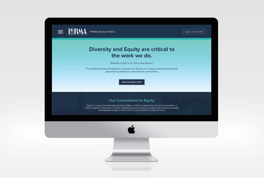
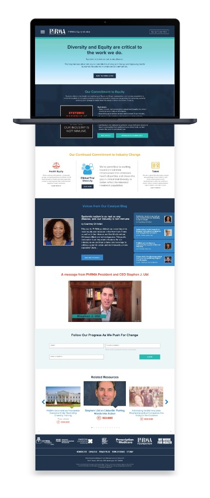
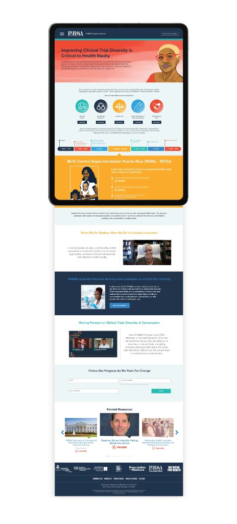
The Challenge
PhRMA needed to engage in a conversation that many in the industry had historically avoided or mishandled. Health equity, particularly in the context of racial injustice, required more than participation—it required credibility, self-awareness, and a willingness to acknowledge a complicated past while contributing meaningfully to the present. The challenge was to help a legacy industry show up in a way that felt human and accountable, balancing honesty with care while avoiding work that felt performative or overly polished.
My Role
Art Director, leading the visual direction of the campaign. I collaborated with project managers, UX designers, and writers to bring the work to life. The campaign incorporated illustration from an external artist, which informed key aspects of the visual system, including color and tone. Within that framework, I led the design execution, ensuring the work felt integrated, intentional, and aligned throughout. My focus was on translating tone into visual language, creating work that felt credible, human, and appropriately restrained given the sensitivity of the subject matter.
The Approach
The work balanced expressive visual storytelling with clarity and responsibility, using bold, stylized illustration to create a distinct and engaging point of view while remaining grounded in the subject matter. The campaign incorporated illustration from a Black artist whose work focuses on representing underrepresented patients in medical contexts, ensuring the visuals reflected lived perspectives aligned with the subject matter rather than being interpreted from the outside. With illustration establishing key elements of the visual language, including color and tone, the design system was built to support and organize that expression, using layout, typography, and pacing to guide the experience and ensure the information remained clear, accessible, and emotionally appropriate.
Impact
The campaign supported broader organizational efforts to advance health equity and improve representation within clinical research, reinforcing PhRMA's commitment to more transparent and inclusive communication. In an industry where 50% of clinical trials take place in less than 2% of U.S. zip codes, limiting access and representation, the work helped translate these initiatives into a clear, human-centered experience—making complex issues more visible, accessible, and credible while supporting more trust-building communication.